
No Developer Needed to Make Your Data Visible
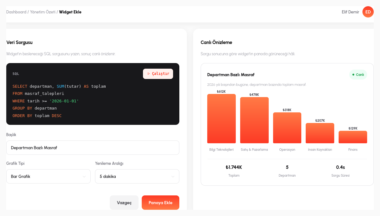
Write your SQL or MongoDB query (or let AI write it for you), drag and drop your widget, and your dashboard runs on live data within minutes.
Not a Static Chart, a Live Connection
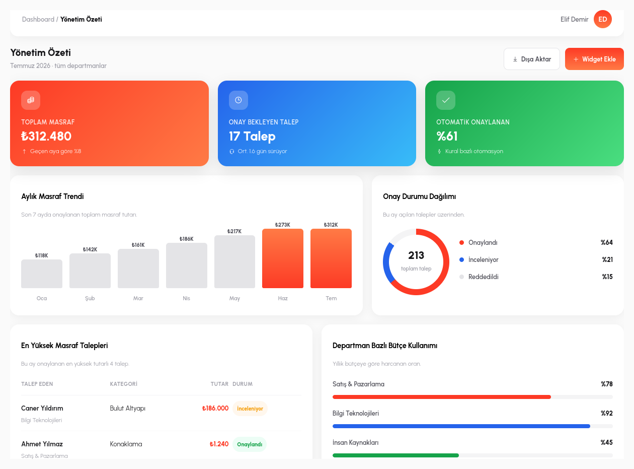
Dashboard design starts with drag and drop: you drop a widget onto the canvas, resize it, position it. But more important than the visual layout is the data source behind each widget. In RiverAI, that source is not a frozen export or a one-time imported table, but a directly connected SQL or MongoDB query. Every time the dashboard is opened, the query runs again and fetches the data as it is right now; it shows the current state, not last week's report.
If you'd rather not set up the widget by hand, AI steps in: type a natural sentence like "department breakdown of this month's open requests" and RiverAI automatically builds both the required query and the chart type best suited to that data; you simply approve the result. The chart palette is broad: bar, line, pie, gauge, table, and single-value KPI cards, with the most meaningful visualization chosen or suggested based on the data type.
Clicking a bar in a static chart means nothing; in RiverAI, it does. When you click a pie slice or a bar in a bar chart, you can drill down into the actual records behind that segment. If you look at "the Finance slice of this month's open requests," clicking that slice shows you the individual request records underneath. A chart is not a summary; it is a doorway.
Let Users Build Their Own Filters
Users can customize the dashboard with their own filters (date range, region, department); every widget is recalculated against those parameters, because the query runs again in real time on every request. When a regional manager selects their own region, all the charts, KPI cards, and tables on the board update instantly to that filter, with no need to request a separate report.
An automatic refresh interval can be set per dashboard: an operations screen can refresh itself every 30 seconds, while an executive summary may only need to update once a day. Dashboards are also shared on a role and tenant basis: a department manager sees only their own department's board, while headquarters sees the consolidated view; the same dashboard definition can present a different slice of the data at different permission levels.
For reports that don't need to stay on screen, export to PDF or Excel is a single click; the dashboard's current view is carried over exactly as-is into a board presentation or an email attachment.
- Live SQL/MongoDB Connection: every widget is backed by a directly connected query; the query runs again each time the dashboard opens, never displaying a frozen export.
- Natural-Language Widget Setup: from a sentence like "department breakdown of this month's open requests," AI automatically builds both the query and the best-fitting chart type.
- Drill-down: click a chart segment to drill into the actual records behind it; a chart is not a summary, it is a doorway.
- Parametric Filters: users set their own date-range/region/department filters, and all widgets recalculate in real time.
- Role- and Tenant-Based Sharing: the same dashboard definition shows a different slice of the data at different permission levels.
Let's Make Your Data Visible Together
In a 15-minute demo, let's build a dashboard with your real data.
Request a Demo